
Today I’ve been playing around in Jupyter Notebook, trying to learn how to do visualisations and data analysis in Python using a copy of the WDB_Accused data downloaded from the Survey page on Edinburgh Data Share. I was working through ‘Artificial Intelligence Foundations: Machine Learning’ by Kesha Williams in LinkedIn Learning but went away off on my own little exploration using the Survey data (the WDB_Accused table specifically).
First thing I had to do was add in the column headings to the file so I did this in Excel and saved as a CSV. I’m sure there would be a way to do it programmatically in Python if my skills were better. I used a few libraries to help with the data analysis and the visualisations and I’ll briefly describe them here.
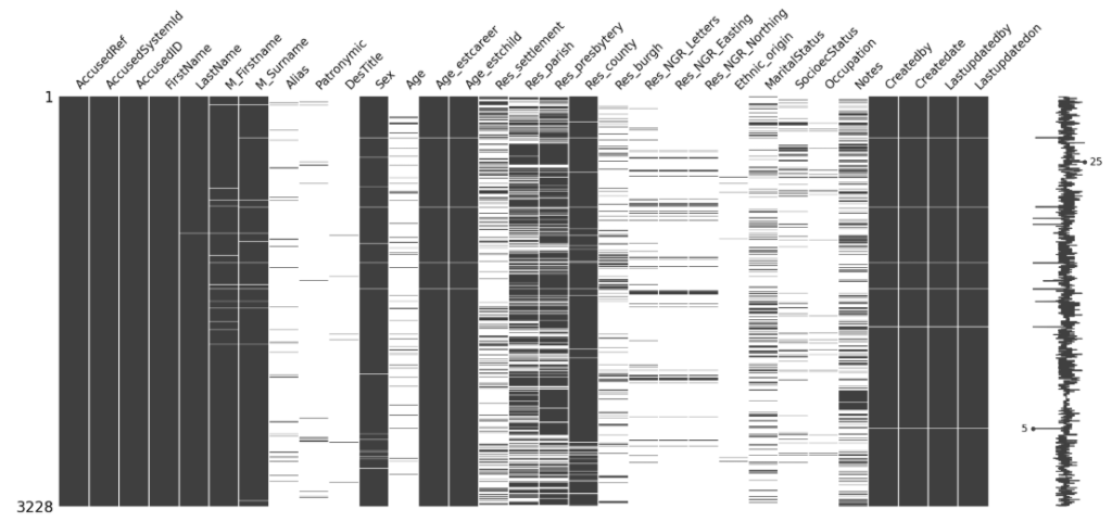
Where are the gaps in the data?
This was quite an interesting visualisation, which I played with to learn how to install libraries but also interesting to see where the gaps are in the data. The data has missing values where information couldn’t be found – obviously the keys for the data which were added by the researchers would all exist but things like the full name, age and location weren’t always available in the data and this was a great visualisation to show what exists and what doesn’t.
Heatmaps
I used Seaborn to create some heatmaps but the numerical data in the survey is a bit patchy and mostly the fields are text and so I didn’t manage to extract anything useful. I think I’ll revisit heatmaps later.
Interesting data analysis
I used python to do a few things I’d normally do in Excel and was surprised at how easy it was (and how dynamic it was to do it in Jupyter Notebooks). So some interesting findings about the data:
Sex
Female 2702
Male 468
No surprises there, my vibe coded Survey site already gave me some of these statistics. But some other stats I hadn’t even considered:
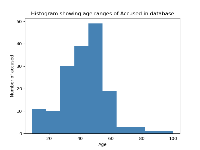
(although I know age was estimated in a lot of cases in the original survey, it’s still interesting)
Less than 18 years old
N 3208
Y 11
So 11 of the accused were children!
Seventy Or Over
N 3213
Y 6
Six of the accused were 70 or over. One of the accused was 100 years old!
Graphs
I plotted a histogram using Python (MatLibPlot) showing the age spread of the accused.
I have much to learn but I’ve not used Jupyter Notebooks in anger before and I can now really see why it is so popular in the sciences. Effectively you are documenting your progress as you go. You can rerun your code really easily and make changes and easily see the impact. It’s a fabulous learning tool.
Anyway, will continue to work on this and will post more soon. The irony of this is was that I wanted to learn about AI and haven’t really got there yet because I got distracted with the data cleansing bit before the actual model training begins!